Contemporary, Colourful - Burwood's New Look
Published on 22 August 2019
Burwood has a new image and identity, reflecting the changes which have made it a vibrant and multicultural destination while retaining its heritage.
Burwood Council will roll out the new brand identity, which will better promote the area’s attractions and benefits as well as guide the Council in serving residents.
People will start to see brand identity signage and other changes from September 2.
Residents’ input guided the design.
Feedback included that the area had grown to become a vibrant, dynamic, more diverse one, and a visitor destination.
The previous identity no longer reflects the area.
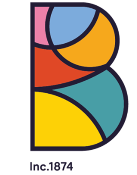
The new logo design, based on the letter `B’, is divided into six parts for the suburbs of the area: Burwood, Burwood Heights, Croydon, Croydon Park, Enfield and Strathfield.
Residents’ priorities are represented by the colour scheme: harmony and friendship (pink), trust and stability (light blue), creativity and vibrancy (orange), heritage and heart (red), the natural environment (green) and energy and optimism (yellow).
Traditional typeface has been used in keeping with the commitment to heritage.
Mayor John Faker, a resident who grew up in the area, was pleased to see a contemporary identity which reflected modern Burwood.
“I am proud we have created something inspiring that is built on the shared vision of the community and Council,” he said.
“This dynamic result will serve us well into the future.”
The previous ‘Municipality of Burwood’ logo was designed in 1936.
While the new look is exciting, the branding change will not be introduced overnight.
A sustainable rollout will keep cost and material waste to a minimum and existing items will be replaced only when needed.